Four Ingredients That Make For a Great Digital User Experience
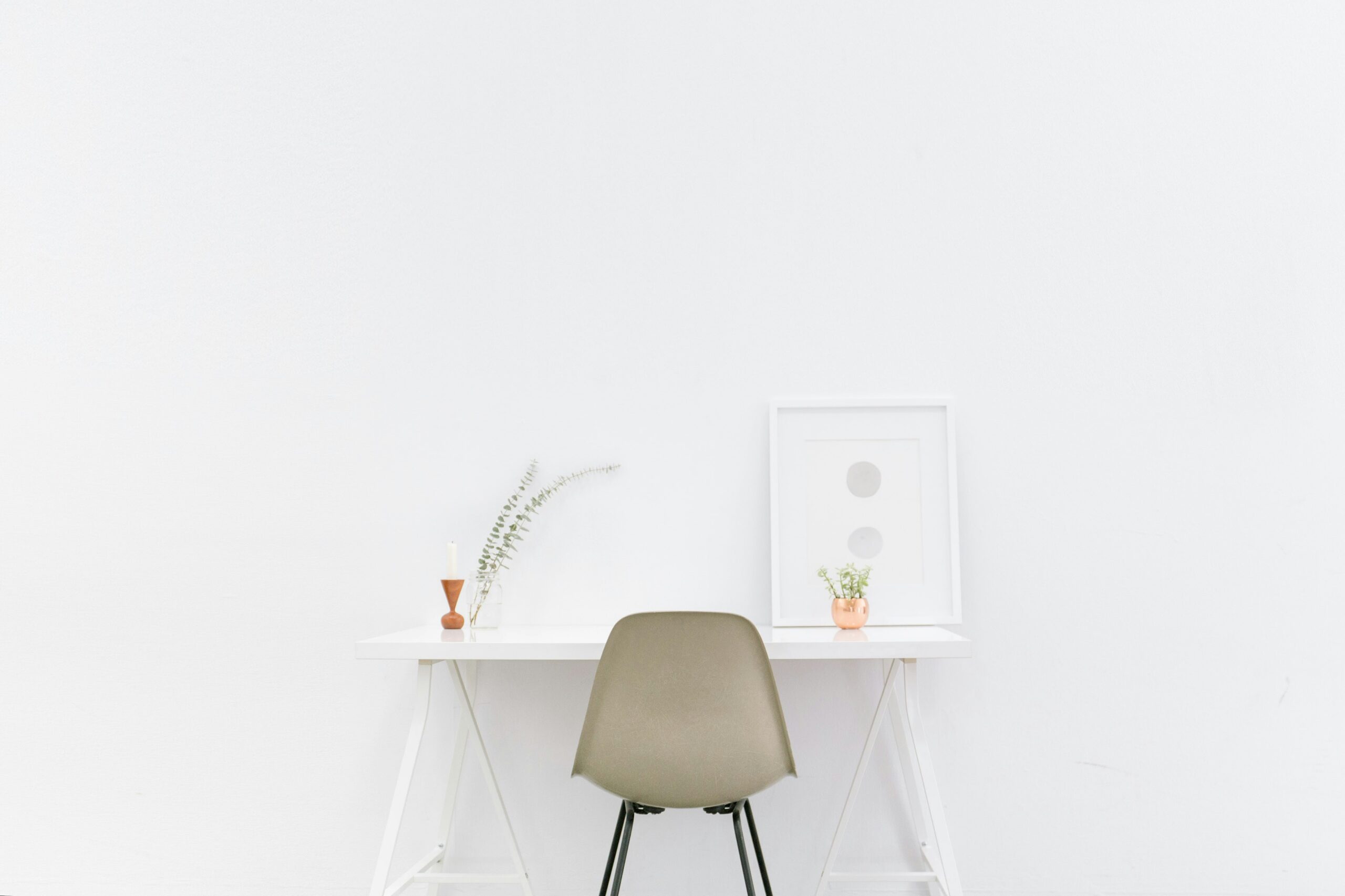
It’s become a bit of a cliché to say “less is more” in web design. But a cliché is only a cliché if you are simply paying lip service to an idea without really understanding or applying the original idea properly. In this case, that original idea is minimalist web design.
Minimalist design centres on the belief that simplicity is often more effective. In the context of web design, minimalism means avoiding on-page ‘clutter’, only including elements that are absolutely necessary, keeping colour schemes and layouts simple and easy for the eye to scan, and making sure navigation is as straightforward and intuitive as possible.
Paying lip service to minimalist web design often means treating it as a purely aesthetic trend. But a minimalist approach should go a lot deeper than what’s visually appealing. The true art of minimalist web design is creating a better user experience that makes it easier for visitors to use a page and therefore drives conversions for your business.
In addition, by simplifying website design, you make it a lot easier for pages to render well across different devices, which is essential in the mobile age.
In this article, we’ll explain how professional web designers use minimalism as a strategic approach to boost website performance.
Minimalist Web Design Core Principles and Best Practices
It’s tempting to think that web design is all about creating a ‘wow’ factor, and that loading pages with photographs, graphics, animations, videos and novel navigation is the best way to create a point of difference with other websites.
There’s nothing wrong with making web pages visually interesting, of course. But it’s easy to over-egg the pudding. The starting point of any web design should always be, what’s best for the user? And the answer is always, whatever makes the site or page as easy and intuitive to use as possible.
Stripped-down content
Images, videos, eye-catching animations etc certainly have a place in web design. But minimalist design teaches that you should use them sparingly. Add too much to a page, and it quickly starts to look cluttered. People use web pages by scanning for the information they want quickly. Cluttered pages make it hard for the eye to do that efficiently.
A minimalist approach therefore prioritises the content you most want visitors to see. This starts by defining key messages and calls to action (CTAs). What do you want people to learn from the page? What actions do you want them to take?
From there, you can create a hierarchy of content. The most important messages go to the top and left of the page. You should then ask, does any intended content contribute to the key messages? If not, leave it out. It just becomes a distraction. This applies to entire elements like images, videos etc. But also to the size of content. Can you write that paragraph more precisely? Would shrinking that image down make it easier to scan the rest of the page?
Pairing back content to what is absolutely necessary helps with usability, information retrieval and navigation. It means you can focus attention on what really matters – your products, services and CTAs. Less content also helps maintain optimum page loading speeds, another essential factor in usability. Research shows that web users will simply abandon a page that doesn’t load quickly.

White or negative space
As a counterpoint to the content on your page, minimalist design teaches the importance of white space. Or as it is more accurately known, negative space (it doesn’t have to be white!)
Negative space is anywhere on a web page that doesn’t have any content. It’s what wraps around and between content and page elements. It’s easy to dismiss it as ‘dead space’ and therefore think you always have tofill it.
But negative space is an important tool in effective web designs. It creates clear separation between elements, which helps with scanning and keeping everything ‘uncluttered’. Minimalist design pays attention to the negative space as a layout tool to achieve a balanced, user-friendly effect.
Colour
Colour schemes are important in minimalist design. There’s no single answer as to what a ‘minimalist’ colour palette looks like. You can use muted, pastel tones or bright, bold colours. But a general principle is not to use too many colours. A maximum of five is a common rule of thumb.
Website designers taking a minimalist approach think of colour in three ways. First, it’s important to consider the impact on usability. Filling backgrounds with solid blocks of darker colours, or certain colour clashes, can make it harder for the eye to read what’s on the page.
Second, minimalist design looks to use colour to create contrasts. It’s ok to have areas of bright, bold colours. But it’s important to then balance them with more muted or even blank areas. This works in the same way as negative space. It also creates visual interest.
Finally, the best designers will consider the psychology of colour. Or, the associations different colours create in people’s minds. This goes hand-in-hand with branding.
Current Trends in Minimalist Web Design
While minimalist web design shares a common set of principles, there isn’t one single approach for putting them into practice. Here are some of the most popular trends currently shaping minimalist web design approaches.
Flat design
For a long time, web designers put a lot of time and effort into trying to create 3D visual effects, based on the idea that adding ‘depth’ to on-page elements achieved better contrast. But in the last decade or so, certainly as responsive design has become more important so web pages work consistently across different devices, the thought process has flipped.
Flat design concentrates on simple 2D shapes. Contrast between elements is achieved by sticking to simple layouts and colour schemes. One benefit is that this very stripped down approach speeds up the design process. But it also helps to ensure that pages render well on different screens.

Mobile-first design
Another trend heavily influenced by the need to make websites responsive to different devices, mobile-first design means focusing on how a site looks and functions on a mobile device first, and then desktop. This is a big switch in web design in the sense that most developers work on desktop computers, not mobile devices. But given that the majority of web traffic now comes from mobiles, it makes sense.
Mobile-first design links well with minimalist web design because of the demands of a smaller screen. What looks great on a desktop often looks cluttered and difficult to navigate on a smartphone. Mobile-first design pushes a more minimalist approach out of necessity
Microinteractions
Microinteractions are ways of giving on-page clues about functionality and navigation. A good example os a clickable button or other element changing colour when it is hovered over. The user gets a clue that it is ‘active’, without the need for something like a pop-up box telling them they can click on it.
Single Page Design
Single page design simply means building an entire website on a single page. While not suitable for all sites, for smaller sites it can offer a more user-friendly solution than splitting content over four or five pages. Done well, navigation by scrolling rather than clicking links is easier, especially on mobile. And it helps to speed up page-loading times.
Conclusion
One final thing to recommend minimalist web design is the way that it focuses attention on the development process. There is a clear thought process behind every decision made – does this contribute to or detract from the main messages I want to get across? How does it affect the user experience? How does it affect the overall goal of clarity and efficiency?
With that level of analysis and evaluation, it’s no surprise that minimalist approaches consistently result in the most attractive and user-friendly websites out there.
Contact us to learn more about our web design services.
