

Four Ingredients That Make For a Great Digital User Experience
In the digital age, website accessibility is about creating an online space that’s accessible to everyone, as this is not just a matter of ethical responsibility but also a clever approach to ensure your band’s inclusivity and that your message reaches a broader spectrum of people.
Approximately 15% of the global population, equating to one in seven people or around one billion individuals, experience some form of disability and with the number of people who have access to online content steadily increasing, there is a corresponding increase in the variety of obstacles they may encounter in navigating such content are on the rise.
Accessibility in web design refers to creating websites and applications that everyone can use whether that be individuals with neurodiversity, visual, auditory, motor, and cognitive impairments, or those affected by environmental factors such as limited or slow internet connection, device responsiveness and screen glare. By adopting accessible web design practices, you not only comply with legal standards but also foster inclusivity, enhancing the user experience for everyone.
Here are ten ways to maximise the accessibility of your online presence and build more inclusive web experiences:
1. Keep content clear, concise and use readable fonts.
As with the ability to resize the text, choosing a clear and readable font can assist those with visual impairments to be able to read your text easily. Furthermore, the use of plain language ensures your content is easily understandable. This is vital for users with cognitive disabilities and non-native speakers who visit your website.
Simplify information, use bullet points, avoid jargon, and use simple words to reduce confusion.
2. Ensure Sufficient Colour Contrast
It is important to use contrasting colours so that it can greatly assist users with visual impairments to distinguish between them. There are many ways in which people can struggle with differentiating colours, it is best practice to avoid relying on colour alone to convey meaning, as this can be lost if someone is colour-blind, or if they are blind and using a screen reader or assistive technologies to navigate your website.
Furthermore, a high contrast between text and its background improves readability. The WCAG recommends a contrast ratio of 4.5:1 for regular text. For big text or non-text elements such as icons or focus indication, the recommended contrast ratio is 3:1. Tools like the WebAIM Contrast Checker can help you verify your colour choices.
3. Implement Accessible Navigation
A well-structured navigation system helps users find content more efficiently. Implement a simple and intuitive interface with a logical navigation scheme across your site. Including a “Skip to content” link at the top of each page allows users with assistive technologies to bypass navigation links and go directly to the main content.
Likewise, avoid having pages buried within sub-menus and try to include a clear path back to the homepage from every page.

4. Alt text descriptions
All non-text content, such as images, videos, and audio files, can be incredibly useful to convey meaning and enhance the message of your content, so they should not be avoided altogether, however, they should include text alternatives.
You should make sure to embed the alternative text, as this enables screen readers to convey the content’s purpose, so ensure that the meaning is not lost to your visitors who are unable to see the pictures. Use the alt attribute in images to describe what the image shows and provide transcripts or captions for videos and audio content.
5. Disabling Sound on Auto-Play for Media & Include Transcripts
Auto-play features can be disruptive and confuse users, particularly those who rely on screen readers. If you are making use of audio or video content on your website and you have implemented auto-play for the videos on your website, it’s imperative to start them in mute mode. Closed captions should be enabled by default, allowing users the choice to activate sound if they desire.
It’s particularly challenging for individuals utilising screen readers to traverse a website when an auto-playing video with sound interrupts the navigation experience. Such users rely on audio feedback from their screen reader to interact with the site, and an unsolicited video can significantly disrupt this process.
6. Considerate Use of Bandwidth
Although internet access is much wider than it used to be, there are a number of users who are reliant on mobile or public networks. Being mindful of the size of images, video, and audio content, can improve the user experience with limited internet access, such as those on mobile or public networks.
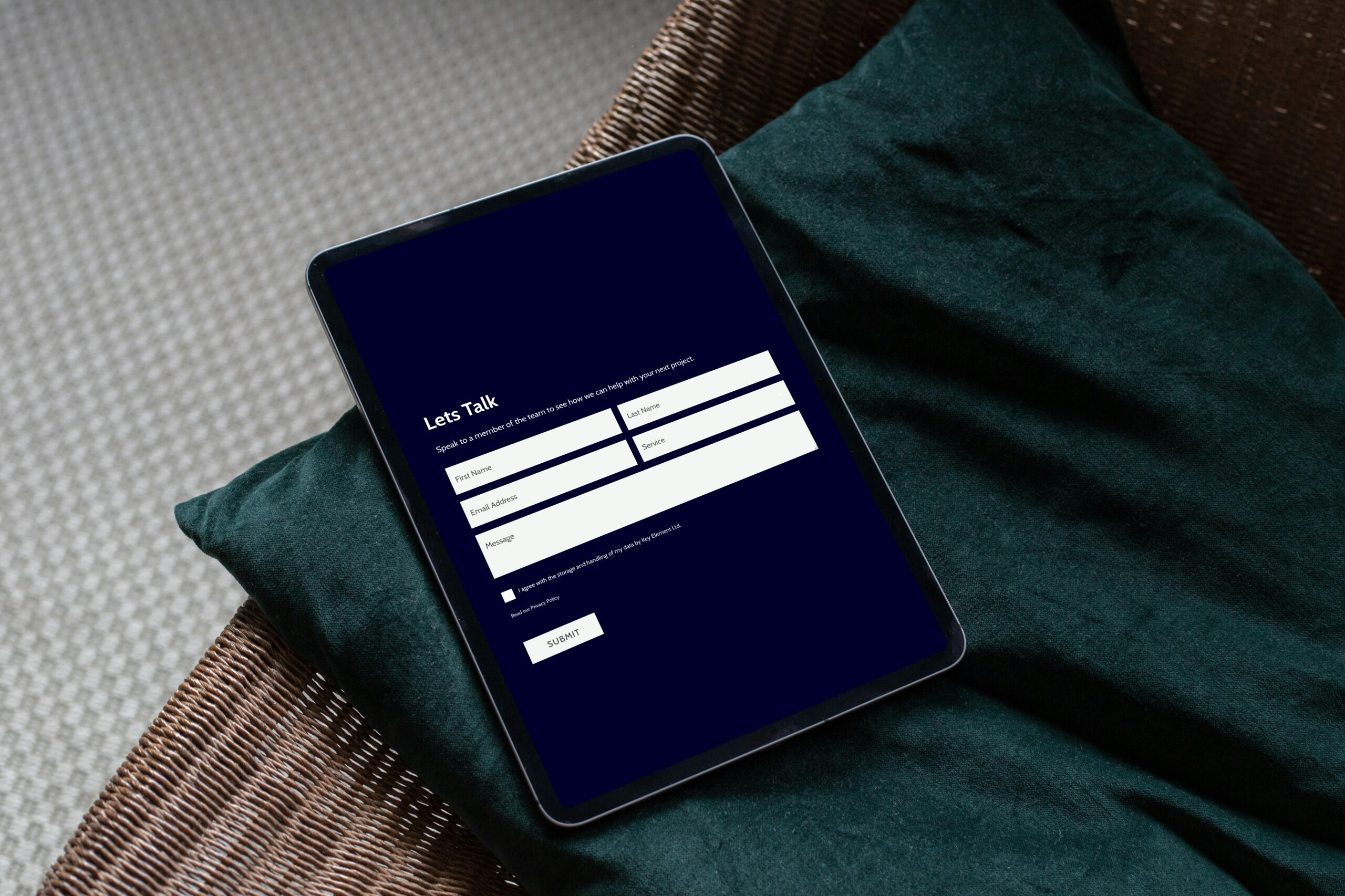
7. Create Accessible Forms
Forms are crucial for many websites as they collect information from users, but if they’re not set up thoughtfully, they can be hard for some people to use. It’s important to make sure everything in a form is clearly labelled so users know what information to put where. Group related parts of the form together and use clear headings to help organise the information.
Also, provide simple instructions and clear messages if something goes wrong, so everyone can understand and use the form easily.
8. Scalable design for Different Devices
As the online population increases, so does the range of devices that are being used. There are a large number of people whose only access to the internet is in the form of mobile phones or tablets.
Making sure that your website has a working mobile version or preferably scales accurately to different screen sizes without the loss of functionality is a relatively simple way to increase the accessibility of your content. It is widely recommended that users should be able to resize text up to 200% without any loss of content or functionality.
9. Use Semantic HTML
Semantic HTML involves using HTML tags that indicate the meaning and structure of your web content. This practice helps screen readers and other assistive technologies interpret and navigate your site more effectively. For instance, use <header>, <footer>, <nav>, and <main> to define the layout, and <h1> through <h6> for headings to ensure content is well-structured and accessible.
10. Keyboard and touchscreen navigation
Many users rely on keyboards, rather than a mouse, to navigate websites. Ensure your site is fully navigable using keyboard shortcuts. This includes accessing all interactive elements like links, buttons, and forms, and ensuring that the tab order is logical and intuitive. Making your website navigable via keyboard will also dramatically increase its accessibility.
Moving Forward
By embracing these ten points, you can significantly improve the accessibility of your online presence. Building inclusive web experiences not only broadens your audience but also demonstrates your commitment to equality and accessibility. To improve your website’s accessibility, do a thorough audit that includes assessments of accessibility, content, and design.
Our team offers a website auditing service which can include accessibility screening, get in touch with us for more information.

Dominique Childs